Part I
Human brains are weird, glorious and driven by a delicate yet robust interplay of various opposing forces. Think about a human being performing a simple task within an environment: you might think of walking through it. Sounds simple, and yet the complexity behind it is beyond our awareness, as the Moravec’s paradox shows. Namely, we are “least aware of what our minds do best”, and going beyond automatic physiological processes and embodiment, merely moving around in the environment is one of those processes. AI researcher Moravec, in the dawn of robotics, noticed that it is relatively easy to “make computers exhibit adult level performance on intelligence tests” or playing chess, and yet “difficult or impossible to give them the skills of a one-year-old when it comes to perception and mobility”. This paradox reflects our brains and how we evolved, and is important to keep in mind when considering human behavior in the built environment.
The act of navigating, or walking through a space, as simple as it is, involves all our senses and motor function, and consists of a number of phases. From mere standing upright, to being visuo-spatially aware of our own body parts, our body’s position in space and the structure of the space itself, then orienting within that space, deciding on the course of action and strategy of movement, execution of said movement, and finally actually moving and navigating through the space. All of the mentioned continues throughout the entire simple action, with our senses constantly updating the feedback from the environment, and our brain adapting sets of actions accordingly. Furthermore, if your goal is to reach a corner of a room or a town square, our brain has to deal with contrasting demands: on one hand to focus on the plan and the goal-relevant stimuli, on the other to be aware and prepared to quickly shift attention to unexpected, potentially goal-relevant, stimuli. This tension between being focused and flexible, between order and chaos, is what makes an organism adaptive.
This is one of the first levels, aside from ergonomics and human biophysiology, which architects should consider, research and collaborate on with neuroscientists. On another level of overlap between architecture and neuroscience, there is cognitive and affective neuropsychology.
Part II
If you are an architect and you design a space, to paraphrase Carl Buechner, people will forget what materials you used, they will forget what the space looked like, but they will never forget how you made them feel. Research in neurophysiology shows that emotionally charged content is most likely to consolidate into long-term memory, so least likely to fade. For example, one of the most vivid types of memory is called flashbulb memory because it acts like a flash of light sealing in the details of a scene or a moment- and is elicited by an unexpected and highly emotional event. In general, we evolved to function in our environment relying heavily on social and emotional cues, and our brains are simply wired to process and remember emotionally charged information better than emotionally neutral information. In a way, which is essential to architects and designers, our brains prioritise social and emotional content.
The emotion of surprise, for example, is crucial in the process of learning about the world, from the earliest developmental stages up to two years of life, to sheer intellectual curiosity in adulthood. The force driving a baby to push a balloon off the edge of a table teaches about the basic physical laws of the world through exception and surprise. It is the same force that drives a scientist and an artist to experiment, just to ‘see what happens’, and is closely related to curiosity and exploration. By using the simplest example of walking through a city square, we can imagine how unexpected stimuli might inspire change of route or exploratory behaviour.
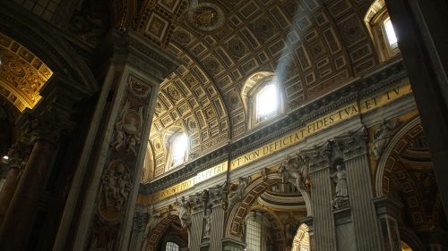
While surprise is, much like fear and disgust, a more basic, visceral and unconscious emotion, and as such more closely connected to survival, complex emotions can obviously be just as uncontrollable and all-consuming. The emotion of awe, for example, contains elements of many other, more basic emotions, such as surprise, fear, amazement, confusion and anxiety. Invoked by the sublime, awe is a potent combination of wonder and fear, one of the strongest positive emotional experiences, with deep, long-term and transformative effect. It is understandable then, how intertwined awe is with the idea of architectural grandeur, religious architecture and aesthetic experiences.
As Burke suggested in his treatise on the sublime, “A true artist should put a generous deceit on the spectators, and effect the noblest designs by easy methods”, and these easy methods seem to include building structures that are just the right size and height, so that the imagination of the spectator/user can “rise to any idea of infinity”. It is this idea of struggling to represent infinity and inducing fear/awe through architecture that brings me to the next chapter.
What can architecture teach us about neuroscience?
We are used to talking about different styles in art, seeing them spill onto philosophy, witnessing them influence science and society, having them intertwined with each other and opposed to one another. We are familiar with the timeline of styles: from long, slow periods of thousands of years, then to hundreds of years, to a recent fast procession and overlap of styles lasting a few decades or even years. Art forms go through art styles approximately, and playfully, at the same time. However, of all temporal and spatial arts, architecture, arguably the most technical, most social and most political art form, is without a doubt the slowest. However slow, it still manages to catch up and embody the spirit of the moment. In case of Gothic architecture, the reflection of the times was presented marvelously. Goethe called architecture ‘frozen music’, yet other than form, rhythm and structure, it is also ‘frozen zeitgeist’, imbued with meaning, layers of social, political, cultural and economic clues, psychological subtext, and functional perspectives.
Form follows function (Sullivan, 1896), and similarly to the terrible1 beauty of a butcher’s cleaver, whose curves and angles are reminiscent perhaps of Art Nouveau2, Finish design3 or even Neo-deconstructivism4, Gothic architecture serves a highly specific function. Namely, its main architectural program was sacred architecture: the church, the cathedral and the abbey. It was sacred architecture that shaped all the elements of Gothic, later just transplanted into other programs such as governmental and university buildings. Architecture is a robust monument to time (zeitgeist) and to space (genius locii)5, and in this case as well, we must view Gothic aesthetics through its form and function equally. The main elements of Gothic architecture are flying buttresses, rib vaulted ceilings, and pointed arches, with other characteristics including stained glass windows and rich sculptural decoration. It is essential to point out that the main three elements are constructive, not decorative, a contrast to previous styles such as Ancient Greek or Byzantine architecture. Never before has construction been so (implicitly) revered and so exposed, not even during the dome-obsessed Ancient Roman architecture. Walter Gropius said that ‘architecture begins where engineering ends’, but the case of Gothic clearly shows that the two are intimately and symbiotically intertwined. Would it even be possible for religion to develop in the way it has, were its main architectural aesthetics decorative, and not constructionist? Never, for it was the engineering feats of Gothic that inspired awe and reverence. In a time without reinforced concrete, steel, other modern materials and technologies, with only stone and brick at their disposal, architects were asked to create temples worthy of God’s glory: light, immense, soaring, weightless, heaven-like. The way they tried to achieve this is the very essence of Gothic aesthetic.
Flying buttresses, those elegant, thin, arched diagonals on the sides of Gothic cathedrals that look like legs of a spider or opulent scaffolding, are a crucial aesthetic element. Their beauty comes from their form and their function simultaneously, but perhaps most of all, their controversy. A common critique of Gothic architecture is that it is a lie, a structure pretending to be something it is not, a simulacrum of a temple. And it is true. Flying buttresses are in fact crutches, holding the building from the outside, always slightly hidden, with their supporting columns richly decorated as to draw the attention away. Indeed, Gothic architecture is meant to be experienced from two locations- from the inside, and from the front. The sides and the back are the machinery behind the curtain, a somewhat embarrassing testament to the builder’s weakness. Like film set construction, where sets are designed to offer an illusion of an exterior (frontal façade supported by scaffolding), and interior (i.e. rooms, halls), Gothic cathedrals feature a glorious frontal façade, and a lavish interior. Two locations, two types of experience, and one story told by both. The religious experience is therefore a carefully crafted illusion, the cathedral itself merely a set, the rituals- performance art.
Even other elements of Gothic architecture aesthetics are, in a way, a lie. As mentioned before, the task of building a temple in the glory of God had many demands, from size, height, proportions, to lighting. One could usually not be achieved without sacrificing the other. The impossible height of cathedrals, for instance, was achieved by using ribbed vaults, and simulated by adding vertical bony elements in the interior and long narrow windows. Windows themselves were adorned with stained glass to distract from the fact they offered little illumination. Stained glass replicated the stories told on the dark walls, so there was a daylight and night time mode of reading the images. The width of the cathedral was simulated by building parallel aisles and galleries, and the magnitude was simulated by adding a transept. The upper part of the interior distracted from a thick forest of necessary columns on the ground floor level, and the columns themselves were ribbed or connected to the vault as to appear more delicate and elongated. The entire aesthetics was a play of illusions and deceptions.
However, there is another side to the Gothic style. To build such grandiose, yet ethereal and lace-like structures from stone and brick took not only craftsmanship and innovation, but adamancy and devotion only art can conceive. The contrast between available materials and engineering knowledge of the times on one side, and impossible demands and lofty aspirations of the architectural program on the other, is a stark, unreasonable one. Yet the story of its conquest is positively endearing, and a telling monument to the human spirit. Perhaps this is the reason why there are so many Neo-gothic styles and revivals, why Gothic architecture seems to enchant us so much, why it is a constant source of inspiration in art, from literature to film- where it is often used as a backdrop of the most emotionally charged genres. Indeed, Gothic aesthetics speaks to our most basic, visceral emotions: fear and love. The two experiences we have the least control of, the lowest common states, and the basis of all passions.
It is fascinating how architecture designed and built in the glory of a divine entity ended up being almost exclusively about humanity instead, revealing human neurophysiology, psychology of an individual and of the society much more than it ever revealed about God.
References
1 Cf. Kant’s and Burke’s ideas on the sublime, i.e. terrible, overwhelming beauty.
2 Particularly Hector Guimard’s façades and fenestration.
3 Particularly Alvar Aalto’s wooden furniture.
4 The classification of arts to temporal and spatial is never neat, in case of architecture specially. As a discipline and an expression, it is highly dependent of both time and space, with zeitgeist (spirit of the times) on one side, and genius loci (spirit of the place) on the other, both interacting with and shaping form and function.
5 The famous Greek order, consisting of three (later five) types of columns, was indeed a constructive element. However, it was almost exclusively the decoration of the column that changes, with no innovation to construction. Furthermore, construction of sleek, stone Greek temples was copied in form and hommage decoration from its predecessor- the wooden temple.


