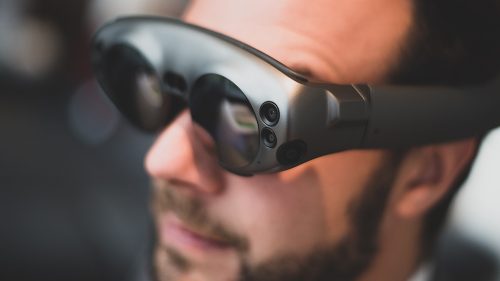
It is well recognised that mobile technologies induce a mode of situational blindness. We spend hours a day glued to our phones, not only while at home or work but as we are walking through our streets. This is not just a generic state of distraction, but a specific disruption in our ability to navigate our cities.
With these electronic appendages filtering and disrupting our perceptions of our environment, it has now become a fact of life that we often negotiate our cities alongside a screen, or to a personal soundtrack: reality intermixed with a constant submersion and emersion from the virtual. This habituated connection to the digital realm has placed us into a learned helplessness. In a way, many have chosen to forgo perceiving the real environment in lieu of the digital. We are at risk of injury, literal and figurative, because of this decision. The ability to navigate the city using cognitive abilities is reduced, as Google Maps, for example, replaces the need to mentally exercise a sense of direction, navigation and place-making.
City-making today increasingly calls for a focus on public transport and pedestrianisation, but this also means taking into account technologies that are increasingly becoming part of our daily lives and the state of distraction that comes with them. The infrastructure of the built environment turns into obstacles and hazards. The aides which prompt us to navigate the city become obsolete as, consciously or not, we block out pedestrian signals, car noises and street signs. An increasing amount of recorded data is showing a growing rate of cell-phone related injuries1 and is adding momentum to the conversation around potential infrastructural solutions for pedestrian safety. Technology such as pedestrian sensors and car safety systems are developing quickly as is the implementation of policy to discourage distraction2. For example, a growing number of accidents related to mobile devices have provoked the implementation of legislation that makes it illegal to use a cellphone while crossing the street in Montclair, California and Honolulu, Hawaii.
What forms of architecture and design have already been affected, implemented or transformed because of our exponential use of technological aids, and what kind of response should architecture and design be instigating for the future?

A common wayfinding aid for the visually impaired in the urban environment are Tactile Ground Surface Indicators (Figure 01). Traditionally, these textured pavers are installed in the ground and are detectable with a long cane or with the underside of one’s feet to assist the visually impaired in way-finding by alerting them of intersections, hazardous surfaces and ground changes. While this kind of initiative was historically relevant to those who were physically visually impaired, they are now being appropriated to assist those that are voluntarily disabled by their mobile screens.

Further, to specifically aid mobile users, the City of Melbourne, Australia has been the focus of a proposed initiative that places ‘in-ground’ traffic lights that resemble Tactile Ground Surface Indicators. (Figure 02) Generated as a response to highly interactive apps that demand one’s full attention, these traffic lights are installed and embedded into sidewalks and would work as signals to be seen by peripheral vision as one is looking downwards toward their screen. Similarly, another infrastructure response designed in part to support smartphone usage includes embedding road surfaces with LEDs in order to signal distracted phone users to upcoming road intersections. This technology also encompasses the use of lights to highlight road hazards or debris, “aiming to enhance people’s perceptual awareness without distracting them”3.
Whilst this technology goes beyond just aiding those who choose to be distracted by their phones, it begs the question, should users have an awareness of their surroundings? Or is the need for awareness, with the exponential integration of digital devices, media and technology in the urban landscape, now obsolete, or at least, outsourced? Besides looking intermittently at a phone screen, or having earphones in, there is the ever-present distraction of the ambient city: advertisements, screens, music, conversations, machines, and traffic. We are always in a state of distraction, with focus required for moments of negotiation for safety and security.
Rather than enable voluntary disability, architecture has the ability to encourage users to withdraw from the digital realm and to engage with their surroundings in authentic, sensory-based experiences. If urban infrastructures are responding to our increased inattention by dulling our bodily and cognitive functions, designers should consider interventions that offer more than just a photogenic and Instagrammable scene, and instead offer occasions to return, literally and figuratively, to our senses.
Some pre-digital or counter-digital design precedents start to speak to this ability to entice the user to break the connection with their handheld device and reconnect with their physical surroundings.
Consider for instance riding the subway to the Museum of Modern Art’s Queens facility in New York, designed by Michael Maltzan Architecture. Framed by the windows in the train car, a series of abstract patterns appear and materialise like a visual puzzle. The museum logo emerges and then dissipates back into the cityscape. Materially, this is achieved through the choreographed organisation of pieces of the logo painted disparately on the building top so that from a certain perspective, it can be read as a whole. The transformation of the mundane billboard atop a building, the flightiness of the illusion and the need to be engaged for a particular moment and position in time, adds a sense of wonderment to the experience. One can imagine a commuter mentally noting to stop and pay attention to witness the magic trick as a means of re-connecting and experiencing the city in a surprising, different, delightful way.
Similarly, but manifesting at a different scale, is the illusion of Louis Kahn’s Salk Institute, in San Diego, California. Standing within the plinth-like plaza, a view of the Pacific Ocean is framed by monolithic concrete buildings. A central channel running down the center of the plaza acts as a salient pointer to command the user to look out to sea. The view becomes intimate, immediate and like a façade itself. However, in reality, the land’s edge meets the ocean a kilometre away.
This play with visual expectations also appears in the BEST Product showrooms, designed by Sculpture in the Environment (SITE) to create intrigue, confusion and re-evaluation of the stereotypical ‘big-box store’4 by visitors. Completed between 1972 and 1984, the crumbling, folding, segmenting, breaking, falling transformation of the seemingly immutable brick façade bewitched users into an alternative reality in which the daily, mundane task of shopping involved interacting with surrealistic public art.
By looking at these examples, architecture has the ability to transform the everyday into wonderment, curiosity and remarkability. By generating these environments within the urban context, architects and designers have the ability to usher back people to awareness and re-connection to their city: the MOMA Queens sign used a fleeting trick of the eye to catch one’s attention, Salk’s illusory drawing closer of the environment while BEST showrooms transformed the mundane into an artistic experience.
In today’s context of overpowering attachment to handheld technology alongside conversations about the need for pedestrian safety and awareness, city design of the future calls for a response to this. The powerful examples previously mentioned prompts: how can architecture transform the mundane into the memorable, to generate spaces that create a connection to the city and the wider community? Can architecture remedy technological blindness by demanding one’s attention, while also activating and connecting the city through punctuating moments of effectual intervention?

One such initiative, Passageways, has transformed its local community by redrawing the attention back to its forgotten alleyways. The program, based in Chattanooga, Tennessee is a community outreach program that emerged from a collaboration between the American Institute of Architects and the River City Company. Initiated in 2015, Passageways saw 70 international artists, architects and designers submitting interventions to transform a selection of alleyways into trafficable hubs of activity (Figure 3). From this competition, five architectural interventions were selected, which encouraged users to inhabit what are typically seen as undesirable spaces in the city. The sensorial effects of these installations sought to bring about a new spatial awareness of the surrounding Chattanoogan alleys that would have otherwise gone unnoticed. The interventions acted as informal way-finding devices via their remarkability and their locations being perpendicular to traditional city flows. They prompted pedestrians to interact with the sites, transforming their original use.
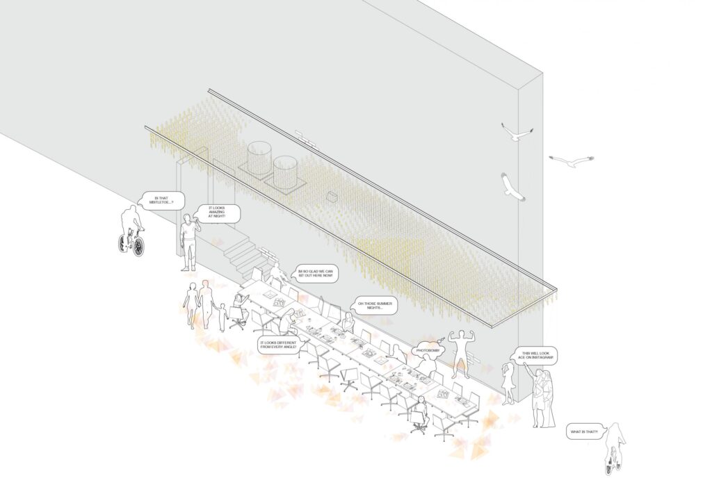
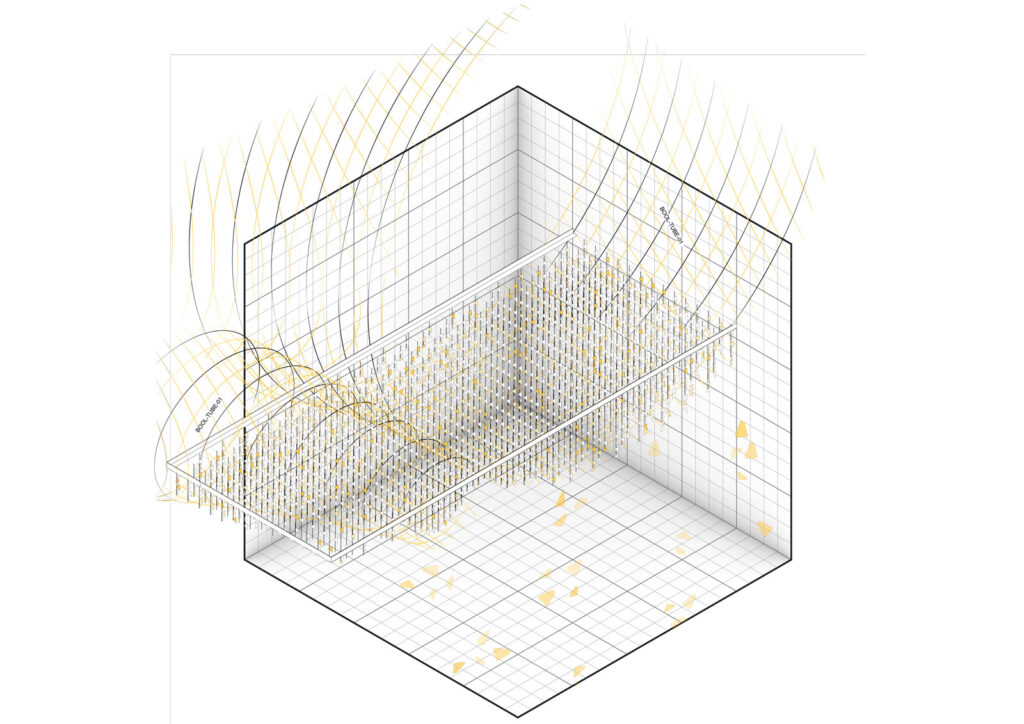
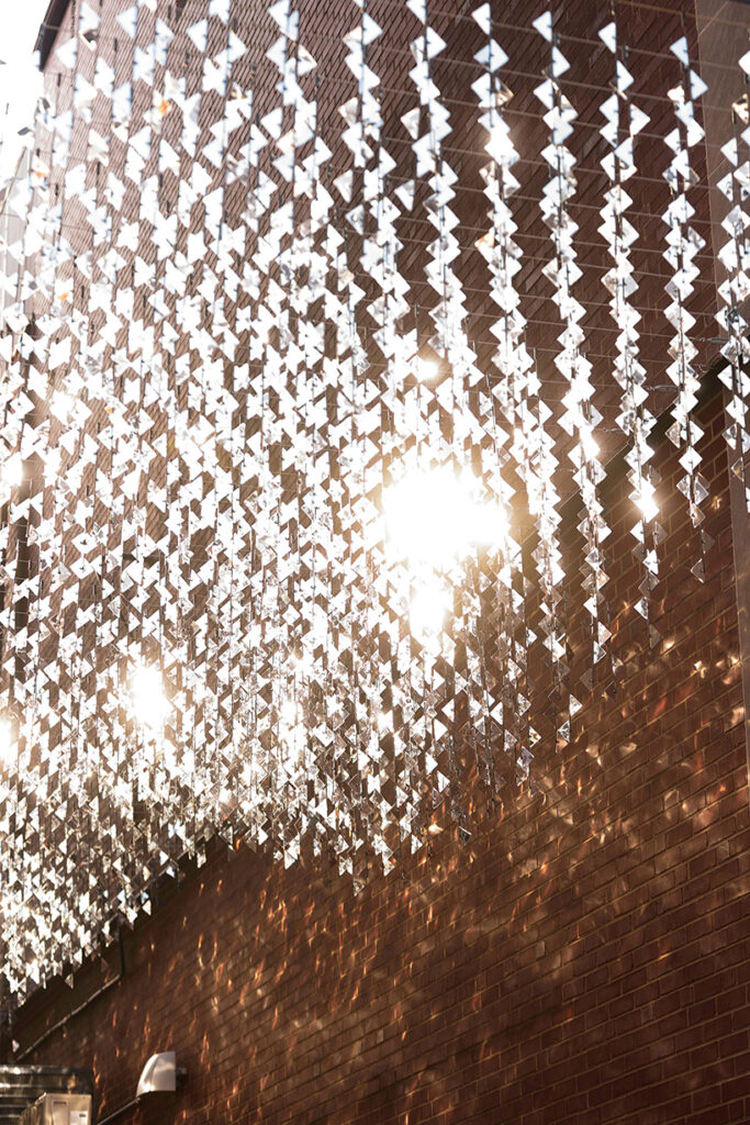
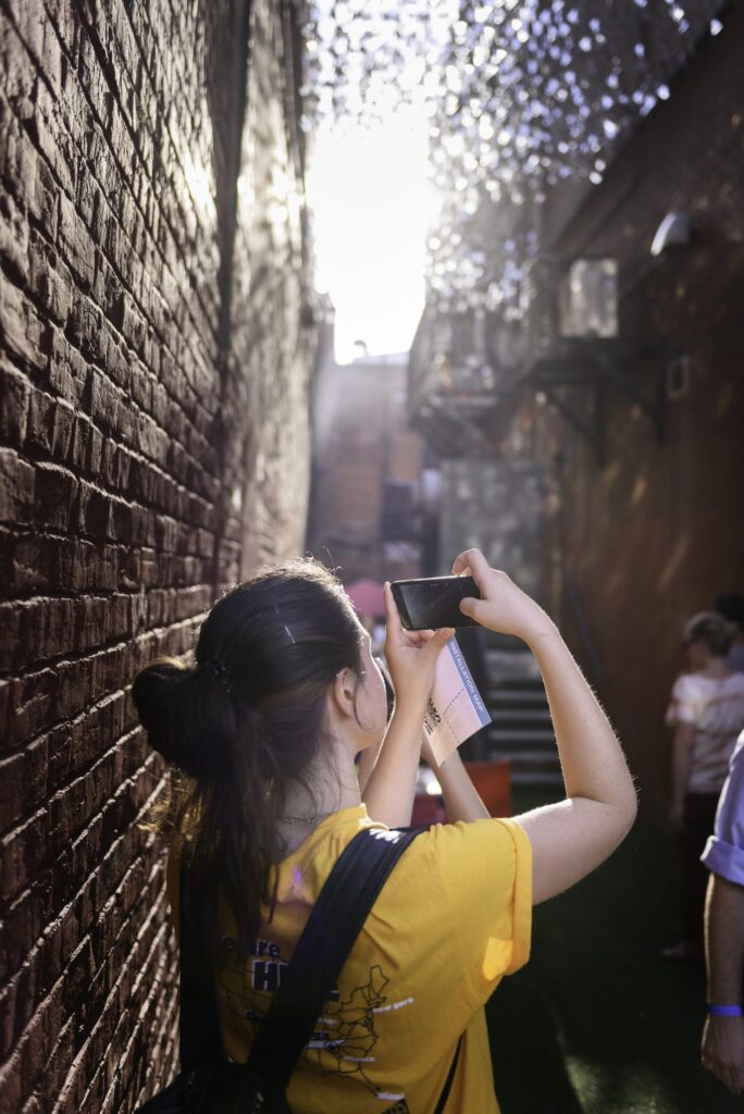
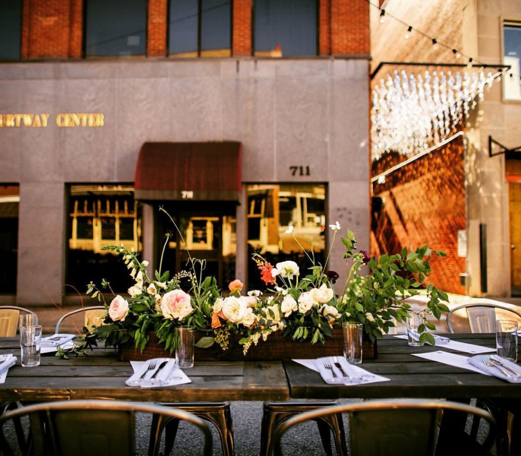
Urban Chandelier, one of the winning proposals by Office Feuerman, transformed the alleyway through the use of sun and wind energy, which would act on rows of reflective tiles that hung from the buildings above (Figure 04 and 05). The inhabitable and immersive canopy created a shimmering play of light upon the alleyway’s surface, prompting the pedestrian to stop and notice the invisible interactivity of weather. With this newfound connection to the finer grain of the urban alleyway, Urban Chandelier also became a site for local events, playing host to a cocktail party as well as a street dinner party. In effect, the installation generates a reconnection to the city and how it is perceived and used. (Figure 06, 07, 08, 09). As a testament to Passageways’ success in stimulating sensory consciousness in the city, Urban Chandelier was made permanent5, and a second iteration of the competition, to complete a permanent installation in a neighbouring alleyway, has led to the current construction of an additional permanent installation. Chattanooga aims to connect the city through a network of art pieces, generating a narrative of immersive, atmospheric spaces that become meaningful, impactful spaces to connect people to the city. They act as markers dotted across the city, spaces that generate a rhythm of cognitive awareness within the urban fabric.
There is an aspect of situational surprise — of continual discovery and rewarded curiosity — that is different from the calculated and algorithmic stimulus of the digital feed, and that can be achieved with perspectival, material, and formal effects. It is nonetheless worth noting the caveat that while these initiatives are, in theory, responsive in aiding the contemporary condition of urban blindness, in practice, they could also be — either by simulating the very media from which they are trying to distract, or by shifting the responsibility for counter-immersion from the user/pedestrian to elements in the built environment itself — complicit in their support. For designers, urban planners and architects, is it now our responsibility to design for easy city navigation, mobile devices in hand? Should it be our mission to enable this compromised awareness of actual surroundings?
German urban sociologist Georg Simmel discussed the notion of mutual strangeness in cities, where individuals could operate both as familiar agents within the metropolis, but also wander and be de-familiarised with their surroundings. In this technologically-alienated society, as designers, we need to foster a sense of ‘strangeness’ in our cities, creating experiences “which increase distance and repel, in the relations of … [producing] a pattern of coordination and consistent interaction”6. By finding new experiential methods of navigating and disrupting the city, perhaps a sense of metropolitan strangeness can distract our gaze away from our screens and back to our environment.
Increased perception and apperception of small and previously unremarkable locations that punctuate the city, brought about by interventions that catalyze conscious attention, can generate a network of personable and identifiable spaces. One can navigate the city by taking note of alleyways, laneways, and byways that become ‘key’ features of the urban fabric and create a mental map; a psychogeography that resists and complements the GPS map. Whilst these interventions do not necessarily drive a user to disconnect their vision from a handheld mobile device, they speak to encouraging users to see their surroundings in a new mode, and forge a new dialogue: if for a second, or a minute, or a journey, I experience my surroundings unaided by technological appendages, what magic, what surprise, what realisations can be revealed simply by looking?

References
1 Jack L Nassar, Derek Troyer, (2013) “Pedestrian injuries due to mobile phone use in public places”, Accident Analysis and Prevention, 57, 91-95, doi: 10.1016/j.aap.2013.03.021
2 Tomitsch, Martin & Ellison, Adrian. “Pedestrian Safety Needs to Catch up to Technology and Put People before Cars.” (2016). Published electronically 26th September 2016. https://theconversation.com/pedestrian-safety-needs-to-catch-up-to-technology-and-put-people-before-cars-65225.
3 Aatif Sulleyman, “Streets Create Safe Crossings for Pedestrians Using Smart Road Lights,” (2017), https://www.independent.co.uk/life-style/gadgets-and-tech/news/starling-crossing-road-safety-umbrellium-pedestrians-cyclists-drivers-accidents-a7991116.html.
4 David Douglass-Jaimes, “When Art, Architecture and Commerce Collided: The Best Product Showrooms by Site,” (2015), https://www.archdaily.com/778003/the-intersection-of-art-and-architecture-the-best-products-showrooms-by-site-sculpture-in-the-environment.
5 Times Free Press, “Art Competition attempts to revive downtown Chattanooga alley (2017), https://www.timesfreepress.com/news/business/aroundregion/story/2017/sep/26/passageways-20-revive-700-block-alley-92downt/451064/
6 Georg Simmel. (1950), “The Sociology of Georg Simmel”, Translated by Kurt H. Wolff. Free Press, New York, 402 – 408.
Reference List
- American Lung Association, “Chattanooga Air Quality Improved, Finds 2016 ‘State of the Air’ Report”, (2016) http://www.lung.org/local-content/_content-items/about-us/media/press-releases/tn-chattanooga-air-quality.html
- Jack L Nassar, Derek Troyer. “Pedestrian injuries due to mobile phone use in public places”, Accident Analysis and Prevention, 57, (2013) 91-95, doi: 10.1016/j.aap.2013.03.021
- Simmel, Georg. The Sociology of Georg Simmel. Translated by Kurt H. Wolff. Free Press, New York, 1950.
- Douglass-Jaimes, David. “When Art, Architecture and Commerce Collided: The Best Product Showrooms by Site.” (2015). Published electronically 7th December 2015. https://www.archdaily.com/778003/the-intersection-of-art-and-architecture-the-best-products-showrooms-by-site-sculpture-in-the-environment.
- Medium. “Tale of Two Cities – Pollution in Chattanooga.” (2018). Published electronically 20th of March 2018. https://medium.com/@hellowynd/tale-of-two-cities-pollution-in-chattanooga-e61631556619.
- Nooga Today, “Finalists Selected for Alleyway Makeover”, (2017). Published electronically 18 December 2017. https://nooga.com/212045/finalists-selected-permanent-alleyway-makeover/
- Outside. “The 16 Best Places to Live in the Us.” (2015). Published electronically 18th of August 2015. https://www.outsideonline.com/2006426/americas-best-towns-2015.
- Sulleyman, Aatif. “Streets Create Safe Crossings for Pedestrians Using Smart Road Lights.” (2017). Published electronically 9th October 2017. https://www.independent.co.uk/life-style/gadgets-and-tech/news/starling-crossing-road-safety-umbrellium-pedestrians-cyclists-drivers-accidents-a7991116.html.
- Times Free Press, “Art Competition attempts to revive downtown Chattanooga alley (2017), Published electronically 26th of September 2017, https://www.timesfreepress.com/news/business/aroundregion/story/2017/sep/26/passageways-20-revive-700-block-alley-92downt/451064/

