What can we learn from public dialogue about the role of colour in improving human-centred city design?
INTRODUCTION
Defining comfort: Comfort is understood as a state of physical ease, contentment, and a satisfying or enjoyable experience. The word’s etymology has Latin roots meaning ‘strengthen’ (Oxford Dictionaries). The focus of this research is human comfort in urban environments, and specifically the impact of colour on comfort.
Urban dominance: By 2050, 66% of the world’s population will be living in urban areas (United Nations, 2015). Human comfort and quality of life matter, and it is therefore important that there is greater awareness about what constitutes good design in the built environment, of which colour is paramount. As the American architecture critic Sarah Williams Goldhagen (2017) states:
“The more we learn about how people actually experience the environments in which they live their lives, the more obvious it becomes that a well-designed built environment falls … somewhere between a crucial need and a basic human right.”
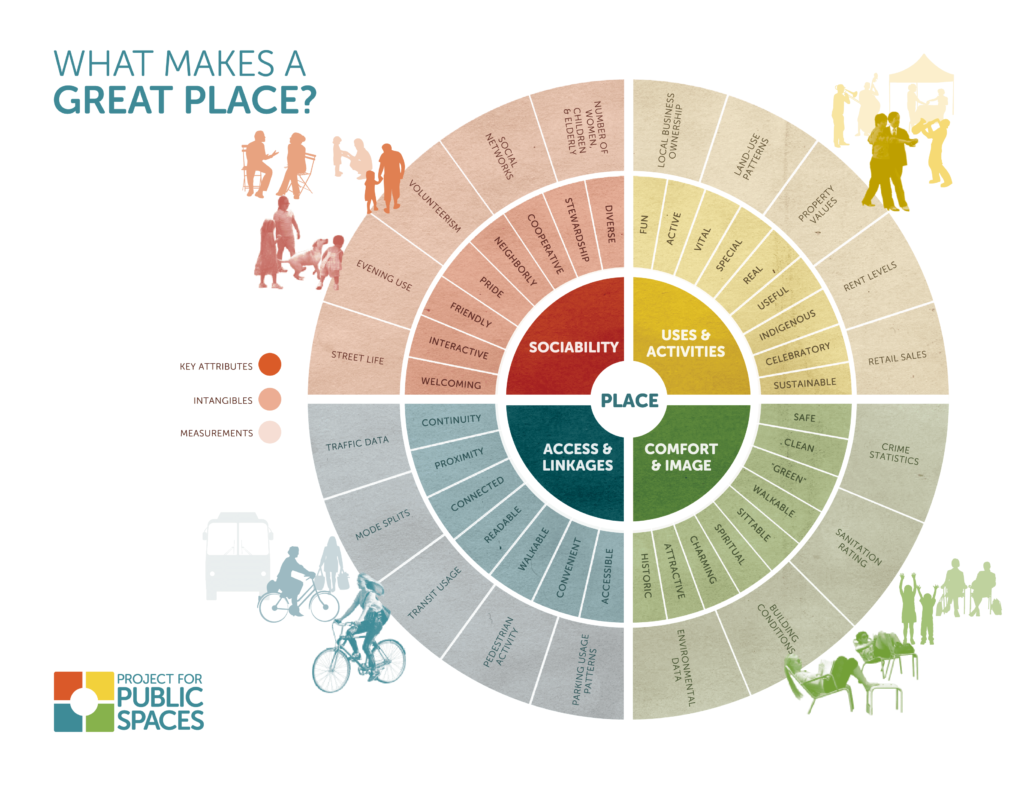
Placemaking: To better understand what makes urban space comfortable, we consider placemaking, which aims to make public spaces into vital places that serve common needs, so they become well used and loved by citizens. The Project for Public Space (PPS) identifies key attributes of great places as Comfort & Image. With the following factors being important, whether a place is: safe, clean, green, walkable, sittable, spiritual, charming, attractive and historic. They identify that great places promote a sense of comfort and are visually pleasing, generally stimulating, foster a sense of belonging, greater security, better environmental quality and a feeling of freedom.
Environmental colour: According to Mahnke (2012), human-environment-reaction in the architectural environment is greatly affected by the sensory perception of colour, exerting a significant psychological and physiological influence. In order to understand further colour in the urban setting, we consider that environmental colour can be defined as the total colour of a particular space which includes natural elements, spatial patterns, colours of the built form, urban elements and also patterns of human activities (Ronchi, 2002).
Approach: Colour Your City is an organisation dedicated to transforming and enriching urban space with colour. Colour Your City’s perspective is to regard urban space as a canvas for creativity, and reimagine it with colour to energise the space and serve wellbeing. Colour Your City wants to see cities where city makers use colour consciously and where citizens are better connected to space, creativity and community. Colour Your City produces site-specific transformations, researches the impact of colour in urban space, has an artist stable of colour-centric artists, and helps organisations to use colour more intelligently. Colour Your City believes in dynamic, energising, playful, fun and intriguing urban space.
Communicating with citizens about the role of colour in urban space is at the heart of Colour Your City. Two collaborative projects have been used as case studies to explore colour and comfort in cities. Both projects invited an open exchange through a #ColourChat question series posed to the public at interactive art installations. This enabled an open exploration into public perception and feelings towards urban colour.
EXPERIMENTAL
1) Colour Your City x PatternNation – Durban, South Africa
Colour Your City partnered with Cydney Eva of PatternNation to colour map the coastal city of Durban in South Africa, and produce two interactive art installations in February 2018. PatternNation is a collaborative visual art and design label aimed at connecting artists who embrace bold colour and pattern globally. The installation comprised of:
a. Photographic exhibition of images taken on several walks to colour map (i.e. visually document) the existing colour palette of the city. Getting ‘out on the streets’ is vital to understanding city space, as de Certeau (1984) states: “The act of walking… is to the urban system what the speech act is to language”.
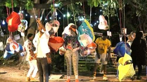
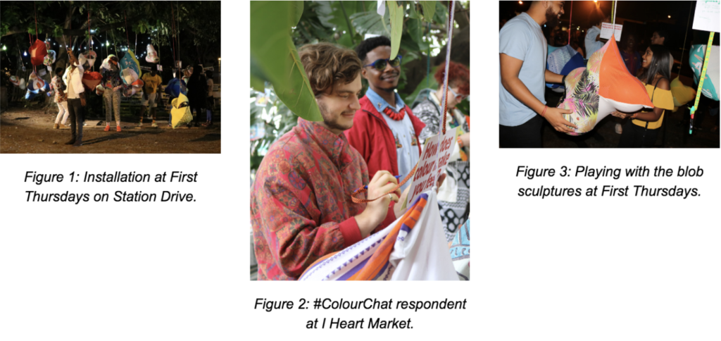
b. Play sculptures – affectionately known as ‘blobs’ – made of upcycled textiles filled with balloons to form cloud-like shapes that were hung from trees.
c. ColourChat conversation series hung amidst the blobs. Each had a key question that explored colour in the city, with a pen for people to write their responses. The questions were posed in an open manner, without specifying a site/location or type of colour, in order to keep the conversation accessible and expansive.
The installation took place at two sites:
- First Thursdays Durban on Station Drive outside Open Plan Studio: An art-focused monthly evening event with approx. 500 visitors predominantly aged 20-30 years.
- I Heart Market: A monthly makers market held during the day, located next to the Moses Mabhida Stadium with approx. 750 visitors and many families.
Nine #ColourChat questions in total were posed, out of which the following have been selected as most relevant to exploring comfort:
How does colour impact your comfort?
Most respondents expressed positive sentiments: “Brings joy” “Colour makes me feel alive and more comfortable with myself” “Helps make us feel expressive”. Several stated the variable impact that different types of colour have, depending on their own feelings/mood, and on the invigorating/bright or calming/neutral nature of the colour.
Does a lack of colour affect urban space?
A unanimous yes! Several anti-grey references: “if you paint the walls grey the people will follow”.
How does colour improve attractiveness in the built environment?
Responses related to:
ALIVENESS: “It creates warmth, brings life and community into otherwise dead space. Personality” “Brings life to the lifeless” “Makes it inviting” “Welcomes”
MOOD IMPROVING: “Makes it look happy” “It raises your mood” “Elevates the mind” “Makes you smile when you’re in the city” “Puts a smile on my face”
INSPIRATION: “Positive. Makes being in town inspirational” “Makes you feel inspired”
2) Colour Your City x Museum of Colours – Berlin, Germany
The Colours in Dis(Order) exhibition took place at the Museum of Colours in Berlin, Germany during April 2018. Colour Your City participated in the exhibition with two #ColourChat installations: one inside the exhibition space at Am Flutgraben, and a second outside at the nearby Kommandoturm (watchtower) in Schlesischer Park. The watchtower used to be part of the Berlin Wall, as a tool of surveillance and division to control the flow of people. Today it stands alone in a very multicultural park, with the lower region covered in graffiti and occasional tours inside the tower. The aim of placing a second #ColourChat installation there was to give the tower a temporary new lease of life and positive purpose, activating the space in a new way.

Twelve #ColourChat questions in total were posed, out of which the following have been selected as most relevant to exploring comfort:
How do you feel about grey in the city?
Most responses referred to negative emotional impacts: “depressed” (the single most common answer) “sad” “boring” “uninspired” “lonely” “cry” “dreary” “lifeless” and a sense of “monotony/routine”. There were a couple of nonchalant answers and one positive: “it’s part of Berlin’s charm”. There was a popular call to “Let’s colour it”.
Clouds and rainy weather were also associated with grey.
How can colour be used to improve urban space?
Most responses indicated pleasing emotional and mood-boosting impacts, such as making people smile and feel happier: “To lighten it. To improve joy” “To influence people’s mood” “Love, peace & harmony” “Expression”.
Reference was made to outdoor activity: “Be the bridge between people in urban space – call them for outdoor wandering”.
Practical suggestions were also made, such as: “Flowers and plants between the cracks and vacant spaces” “Street art” “Paint the grey!”
RESULTS AND DISCUSSION
People’s responses in both Durban and Berlin were overwhelmingly positive in relation to colour in the urban environment, with a lot of pleasurable emotional value (joy, aliveness, expression, inspiration) and clear indicators of comfort (contentment and enjoyment) associated with colourful urban settings. It was also clear that colour has variable effects depending on the nature and hue of colour, and the individual’s mood. Conversely grey was seen as depressing and sad. There were many calls for more colour in the city. This helps demonstrate that colour is a vital factor to human comfort in urban space.
In both cities (especially in additional #ColourChat questions – the results of which are beyond the scope of this paper) there were many calls for more colour, through forms such as street art and nature. We see that there are many practical ways in which to increase comfort by having more creative, artistic and/or nature-oriented ways to add more colour to the city.
The open nature of the installations and ease of participating in the #ColourChat was beneficial for maximum accessibility and a free exchange on the topic, however this was challenging to analyse from a data point of view, since detailed demographic and other data sets were not collected.
Areas for further research include looking at developing the #ColourChat format further to gather participant data. Also to consider the effects of specific colour hues, types of colourful interventions in urban space – both general categories and site-specific studies.
CONCLUSION
We can see that colour plays a major role in our experience of life and levels of comfort. This connection between colour and human comfort in the context of urban space is a pressing and important one, and is to be explored further by Colour Your City, to help shift urban habitats from often being poorly designed and inadequately executed, to places that serve human wellbeing and enhance vitality.
The Conscious Cities community is invited to participate in a special online #ColourChat to explore current perceptions and uses of colour, the results of which will be featured in a future publication.
Join the #ColourChat conversation »
References
Acknowledgements
With thanks to our collaborators: Cydney Eva and Costa Besta of PatternNation, NhlaNhla Gcabashe, Dylan Smith and Open Plan Studios in Durban, and Natacha Le Duff, Claire Hovine and Pierre Renard of the Museum of Colours in Berlin.
Contact
[email protected] • Instagram: @colour_your_city @colourcarver • Twitter: @colouryourcity @cathcarver
Oxford Dictionaries. Accessed January 2018. Oxford University Press. en.oxforddictionaries.com/definition/comfort • United Nations. 2015. World Urbanization Prospects The 2014 Revision. • Williams Goldhagen, S. 2017. Welcome to Your World. HarperCollins. • Project for Public Spaces. Accessed January 2018. Place Game. www.placemakingchicago.com/cmsfiles/placemaking_PlaceGame.pdf • Mahnke, F. H. 2012. Color in Architecture – More Than Just Decoration. Archinect. www.archinect.com/features/article/53292622/color-in-architecture-more-than-just-decoration • Ronchi, L. 2002. Light and Colour in Environmental Design: Some Annotated Terms. www.ad-chroma.com/files/light_and_color_in_environmental_design_some_annotated_terms.pdf • de Certeau, M. 1984. The practice of everyday life, Vol. 1. University of Minnesota Press.

